Role
Graphic designer
Tools
Adobe Illustrator
Cathy's Place of Charlotte County is a peer-driven Recovery Community Organization serving as a beacon of hope for individuals and families on a recovery journey. Through the support of Certified Recovery Peer Specialists, they provide essential resources, peer-led guidance, and a welcoming, resilient community that empowers long-term recovery. Services include Narcan distribution and overdose prevention education, along with community events and outreach that promote connection, reduce stigma, and strengthen recovery support throughout Charlotte County.
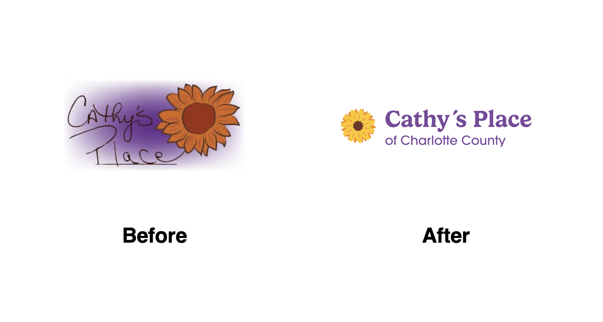
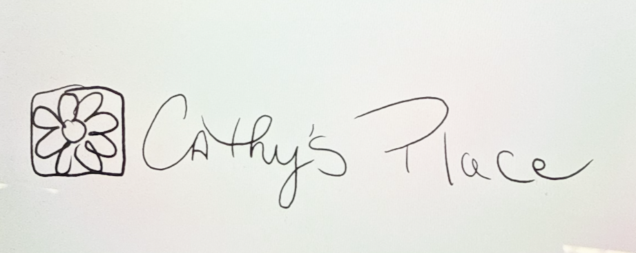
The existing logo, created from Cathy’s handwriting, was very meaningful to the organization. However, it was difficult to use across materials and tended to print too dark. Cathy's Place was looking to create a recognizable, versatile brand that still honors Cathy while helping the organization grow, reach more people, and share hope and connection in the Charlotte County community.
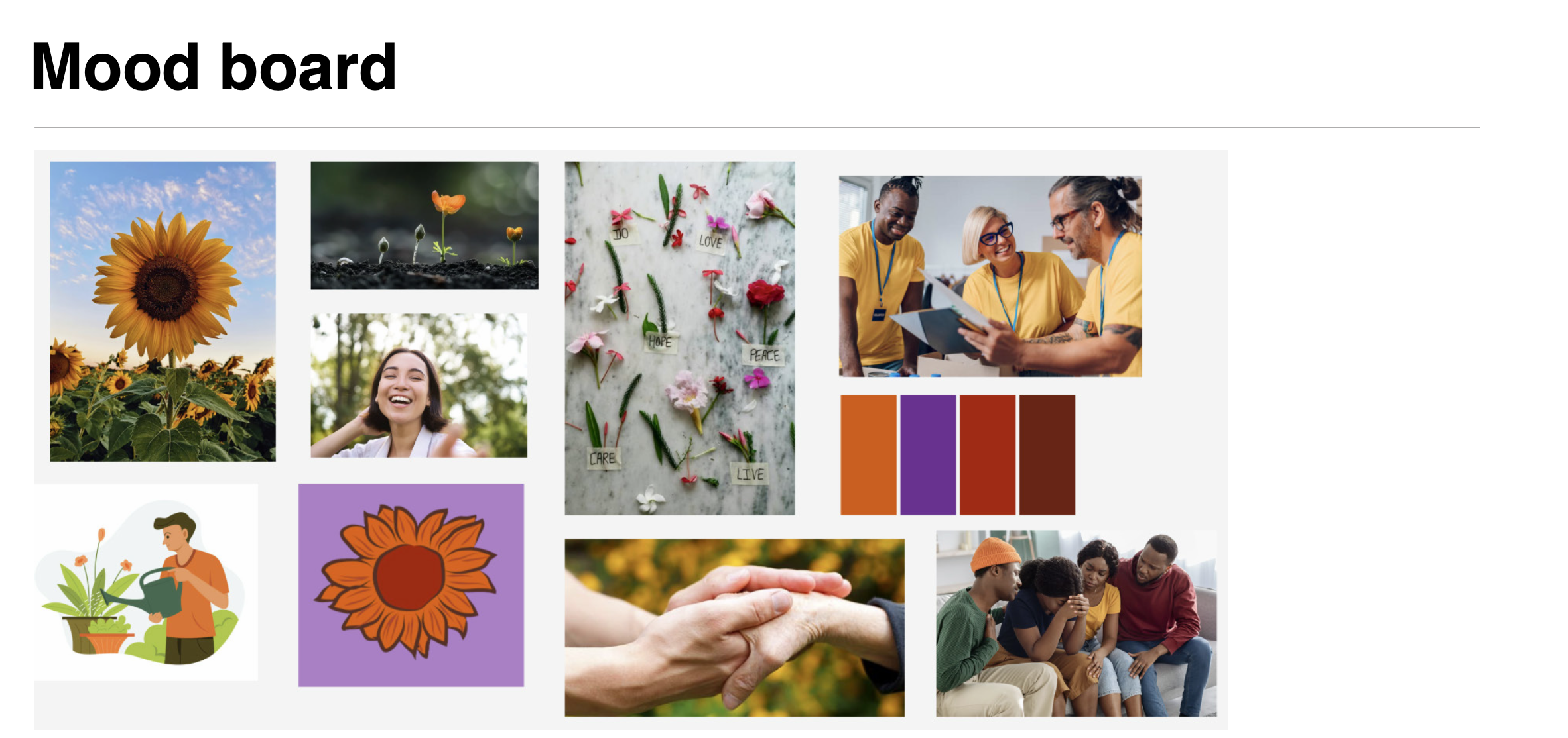
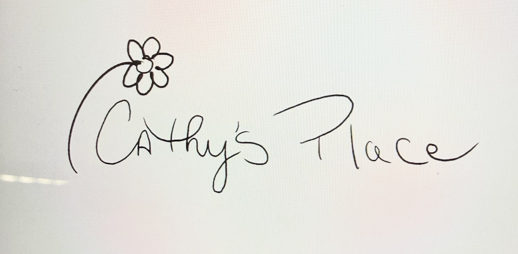
After establishing the client's needs and goals, I began to brainstorm ideas for the Cathy's Place Logo Redesign by visualizing their brand using a mood board and sketching out early concepts. My goal was the capture the hope Cathy's Place provides while keeping a flower iconography and warm look. My early concepts included a sketch of Cathy's handwriting from the original logo, to keep the design grounded in the organizations roots.
I focused on two important things I knew about the client:
1. Loves that their current logo includes Cathy's Handwriting
2. Wants a logo to modernize their brand
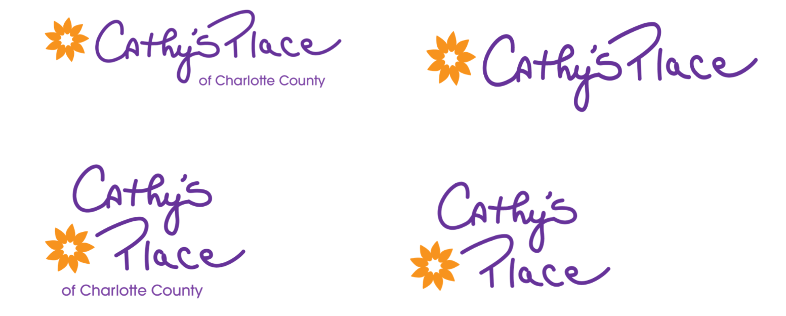
With these things in mind, I focused this first round of drafts on crafting 2 different logo paths:
1. Modern re-imagined logo
Includes a Serif Font and Sans Serif font mix, combing welcoming and modern styles.
2. A Refresh on the original
Includes a reworked custom typeface modeled after Cathy's Place.
The client let me know of two main takeaways:
1. They preferred logo option 1, with the sans serif typography
2. They wanted to explore a more realistic sunflower icon
I then developed a mini deck with three more logo options incorporating more "realistic" sunflowers, each in their own way.
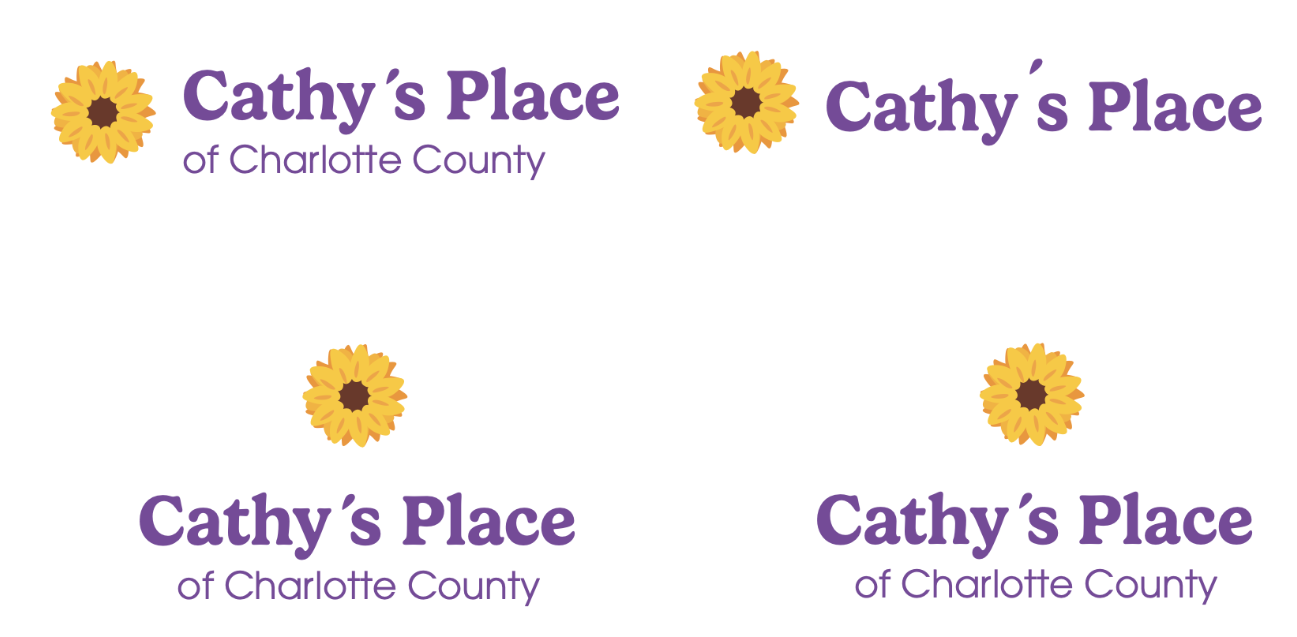
Option 1: Realistic in the truest sense. Used layer petals to emulate a real sunflower.
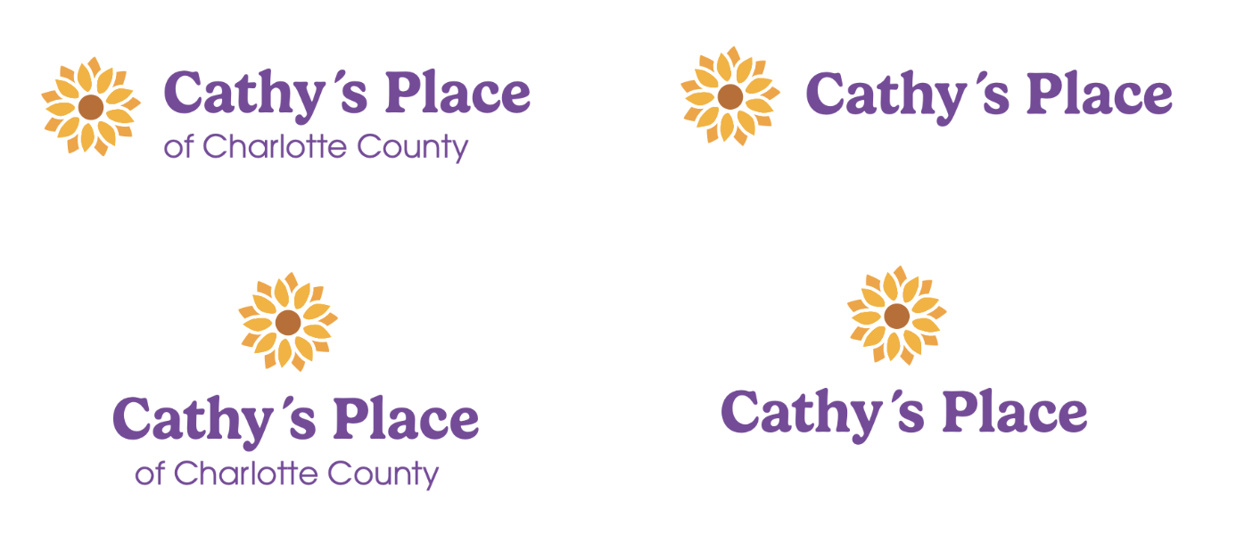
Option 2: A modern and geometric interpretation of realistic sunflower elements.
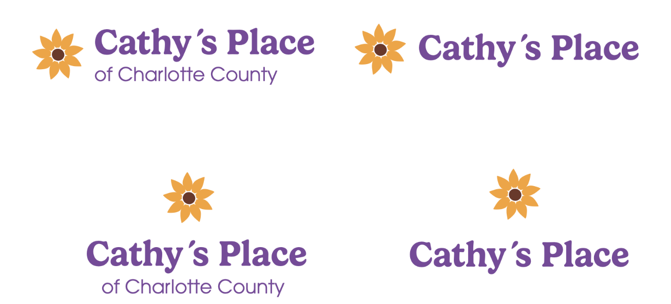
Option 3: A minimalist adaption of a more realistic sunflower.