
Role
Lead UX/UI Designer
Tools
Figma, Adobe Illustrator, Miro, Google Forms, Microsoft Teams, Excel

Research was conducted using survey questionnaires, comparative analysis of other community apps/groups, and literature review on existing mutual aid organizations.
Findings from research was synthesized into 4 identified 4 proposed solutions.
People often hesitate when asking for help due to fear of embarrassment and uncertainty
.svg)
Use prebuilt templates so users can ask for help without having to draft a request from scratch
People feel uneasy trusting a stranger online to successfully complete a task for them
Implement a review/rating system so volunteers can be verified as “trusted”
Existing tools such as Nextdoor and Buy Nothing require user data, increasing safety concerns
Allow users to use anonymous pseudonyms. Don’t require any data beyond email or phone.
Volunteer burnout is the #1 struggle for mutual aid organizations
Allow users to switch between volunteer and user easily, so they aren’t trapped into a specific role.
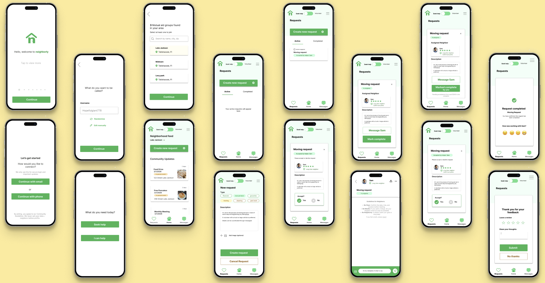
I developed four distinct personas to represent the 'Supply and Demand' of mutual aid, ensuring the interface felt as safe for the hesitant seeker as it did rewarding for the busy volunteer.

Pre-built Templates:
To support Maria’s busy schedule and "low energy" pain point, I implemented quick-tap categories (Groceries, Manual Labor) that auto-fill requests, reducing the time and cognitive effort required to ask for help.

Anonymous Pseudonyms:
To resolve Ari’s "fear of embarrassment" and desire for "dignity," I designed an onboarding flow that generates randomized usernames, allowing her to seek financial or grocery aid without social stigma on campus.

Fluid Roles Toggle:
To prevent Jordan's "burnout," I created a prominent header toggle that allows him to switch instantly between "Volunteer" and "Seek Help" modes, signaling that it is okay to be on either side of the community.

Review & Badge System:
To ease Rosa’s "uneasiness trusting strangers," I implemented a peer-to-peer "Badge" system (e.g., "Great Neighbor!") that serves as a visual trust signal from other community members.
I mapped the parallel journeys of the Seeker and the Volunteer to ensure that at every point of high vulnerability, like asking for help or entering a stranger's home,the app provided a specific safety net. For the Seeker, this meant emphasizing privacy during onboarding; for the Volunteer, it meant providing clear expectations through categorization.


Then, I began brainstorming early concepts for the design
During this rapid iteration phase, I explored five different entry points for the user.
I ultimately decided to move forward with a hybrid of Option 2 and 5, with Option 2 as the landing screen and Option 5 as the dashboard displayed once the mode is selected (Help seeker or Volunteer).
This provided the clearest path for the two distinct user journeys (Help seeker and Volunteer) while keeping the community feed front-and-center.

After exploring various landing page concepts, I mapped out a two-path information architecture. My goal was to ensure that while the Help Seeker and Volunteer have different primary tasks, the transition between these roles remains frictionless. This 'Branch Logic' allowed me to maintain a consistent navigation system (Home, Requests, Messages) while tailoring the feed to the user's active mode.

I continued iterating on designs for other screens.
I continued this process until I developed wireframes for my planned user flows.

I designed these five tasks to stress-test the 'Fluid Roles' and 'Privacy-First' logic of the app. By observing where participants paused or felt uncertain, I was able to refine the navigation and ensure that the transition from a help seeker to a volunteer felt seamless and empowering
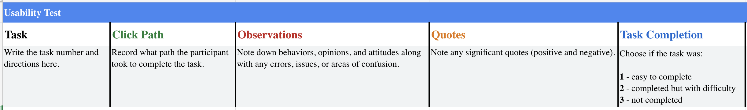
I protyped my wireframes in Figma to create user flows designed for 5 separate tasks that participants would be tested on
Tasks:
1. You’ve just heard about this app and want to see what's happening in your neighborhood. Set up an account without using your real name.
2. You need help moving a heavy sofa this weekend. Create a request for help in your local group.
3. Switch to 'Volunteer' mode and find a neighbor who needs help with groceries. Reach out to let them know you can do it.
4. You are currently looking at requests in 'Lake Jackson,' but you want to see if anyone needs help near your workplace in 'South side.' Change your group.
5. A neighbor just helped you with a task. Mark it as finished and let the community know they were helpful.
To validate my high-fidelity designs, I conducted a formal usability study with six participants. By tracking their Click Paths and recording specific Quotes, I was able to identify remaining points of friction. This data directly informed my final iterations on the 'Mark Complete' flow and the group-switching navigation.
Microsoft teams meetings were conducted and recorded for the test .
Participants were given each task consecutively.
Sessions were reviewed and observations were notated in a prepared Excel sheet.
Participants then participated in a System Usability Scale questionaire.
Lack of confirmation
Users felt lost after hitting submit.
Created a dedicated Success State with a large green checkmark.
Confusing 'Assigned' state
Volunteers didn't know the next step.
Added a prominent "Mark Complete" button and status badges.
Homepage clutter
Users felt overwhelmed by widgets.
Simplified the UI by moving community updates into a secondary tab.
Misplaced arrow
Users hesitated when switching between neighborhoods.
Moved arrow location downwards
Navigation bar
Users questioned which page of the app they were currently viewing.
Added an active state on navigation bar indicating current screen
Lack of written reviews
Users desired the ability to leave a written review, opposed to just a rating.
Added a text input field for written reviews
I began to iterate on my wireframes, incorporating feedback from the usability study.
.png)
.png)
.png)
.png)
To ensure a cohesive and accessible user experience, I developed a lightweight design system for Neighborly. I chose the Inter typeface for its high legibility on mobile screens and established a color palette rooted in a 'Community Green' to evoke feelings of growth and trust. This sticker sheet served as the foundation for the high-fidelity prototype, ensuring consistency across all user flows.

Below are mockups of the final design.
