
Role
Lead UX/UI Designer
Tools
Figma, Adobe Illustrator, Miro, Google Forms, Microsoft Teams, Excel


• User Research
• Personas
• Problem Statements
• User Journey Maps

Research was conducted using survey questionnaires, comparative analysis, user personas, and user journey maps. Research focused on feelings users have about restaurant mobile apps.
Gathered from user surveys
Ugly designs and outdated interfaces
"When a restaurant has an outdated interface, it makes me want to not even use it"
Features that don’t work, such as not being able to view the menu.
"Nothing angers me more than clicking "view menu" and nothing happens or it downloads a pdf. I just want to see the menu!
Hard to navigate, confusing steps
"Some restaurants make you jump through hoops just to find the menu. Like forcing you to start an online order, for example."
Lack of visibility about order status/pickup time.
"I need to know the status of my order and for that information to be accurate."
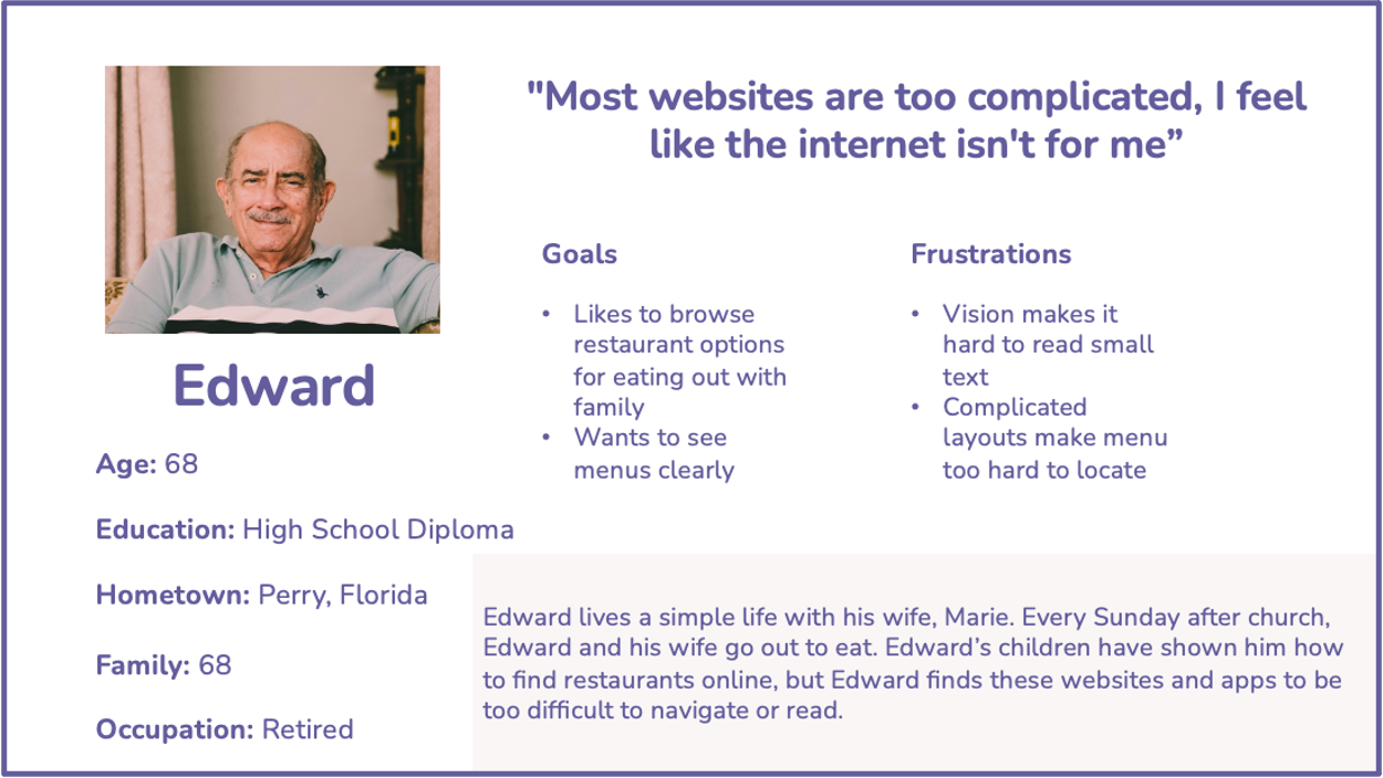
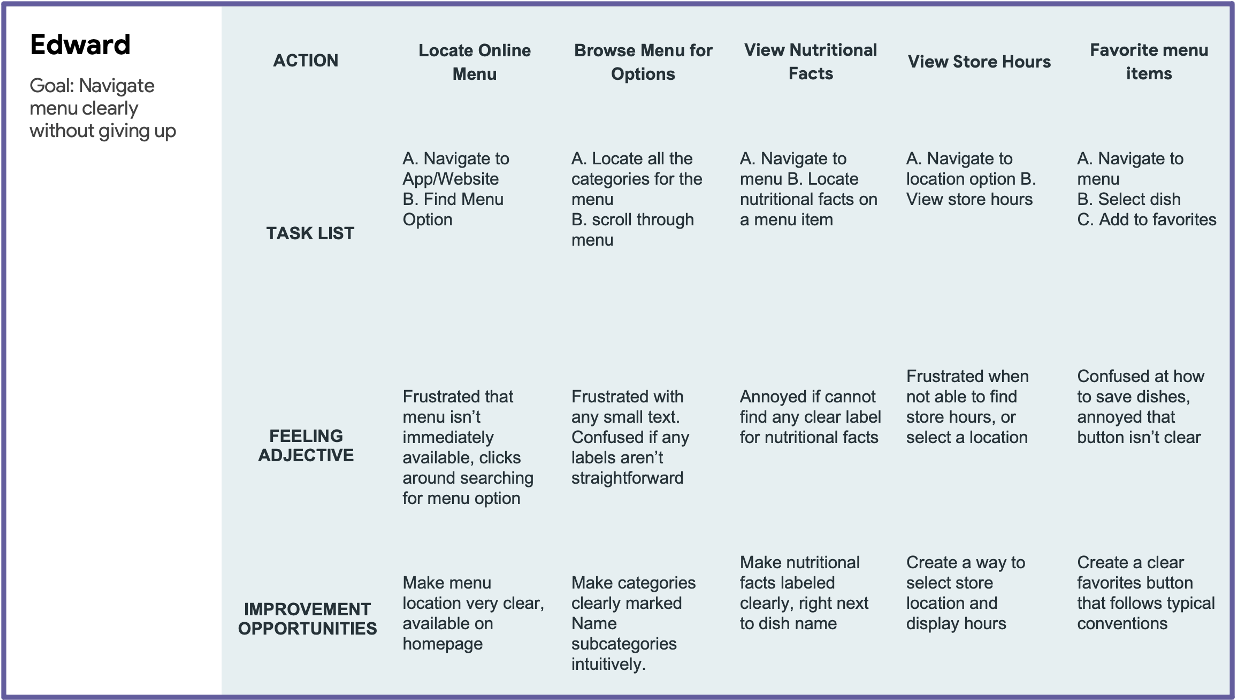
Edward is an older gentleman who needs an easy-to-use interface with readable text, because he is very technologically confident and struggles with his vision.
User Pain Points:
Difficulty navigating
Faulty features

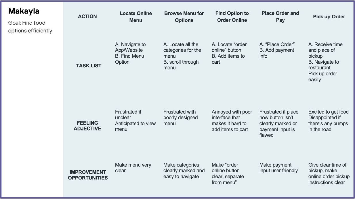
Mikayla is a student who needs an easy-to-use interface, because she grew up with technology and has low tolerance for a poorly designed app.
User Pain Points:
Aesthetic
Poor visiblity
Difficulty navgating
• Paper Wireframes
• Digital Wireframes
• Low-fidelity Prototype
• Usability Studies
I began by getting my thoughts out on paper, drafting paper wireframes to shape the early stages of the design.
I sketched out major navigational components such as the homepage, navigationbar, and side menu.
Then, I sketched out the major touchpoints for the app, including the menu page and ordering page.
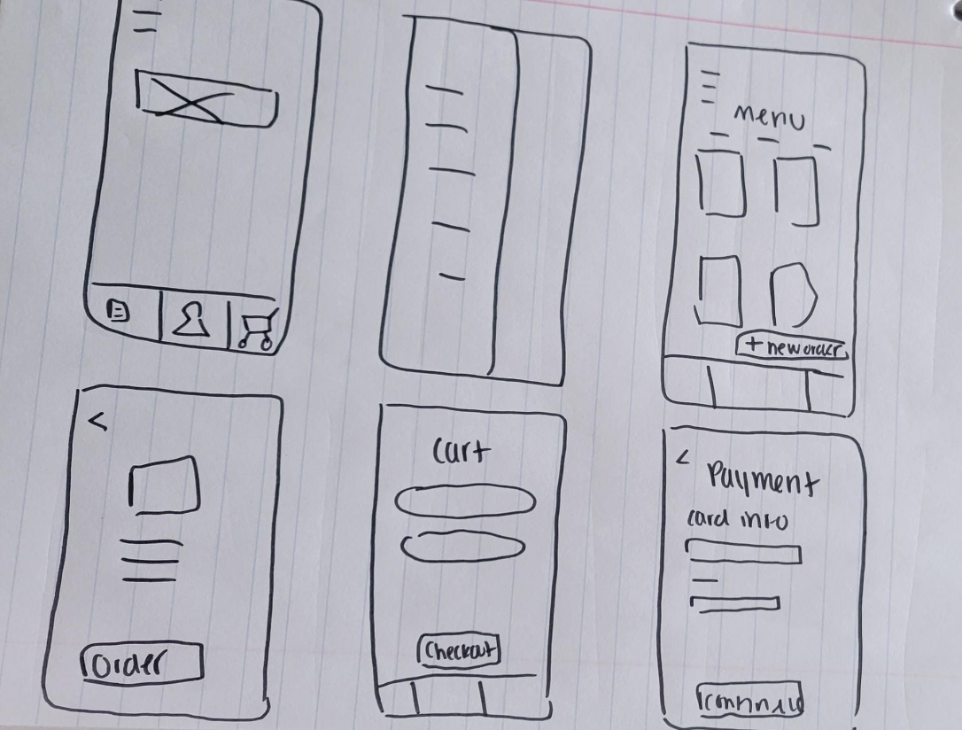
Then, I used my final draft of the paper wireframes and digitally produced them using Figma.
This process helped me map out the frame for the app.The basic structure from the paper wireframes remained, with some additions that came to me during the process.
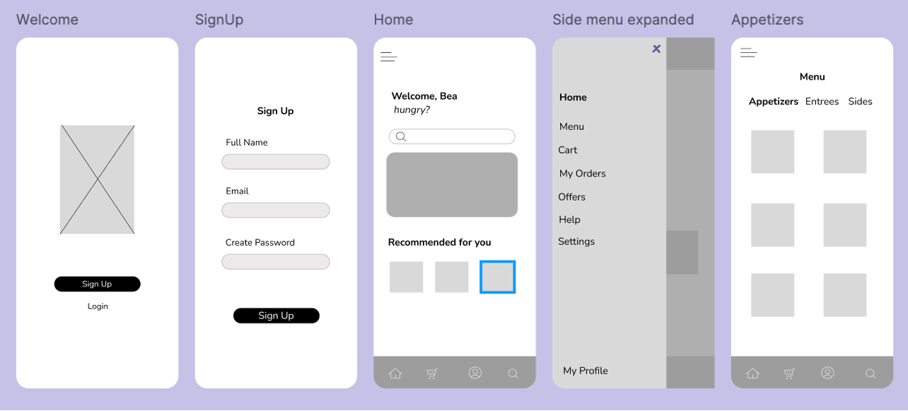
Below is the Low-Fidelity Prototype that was used for user testing.
Low fidelity prototypeRound 1 findings
Testing the basic user flow and information architecture
Round 2 findings
Refining the checkout process and micro-interactions
Users want to view the menu quickly and easy
Users did not want to have to Sign In to view menu
Users want to view completed orders easily
Users found the process of viewing completed orders confusing
Users want more reward functionality
Users found the rewards functionality underwhelming
Users struggled with the navigation bar
Users struggled to recognize icons and what they meant
Users want more customization
Users felt constricted by the lack of customization options for orders and the app
Added text below icons on navigation bar
Improves accessbility
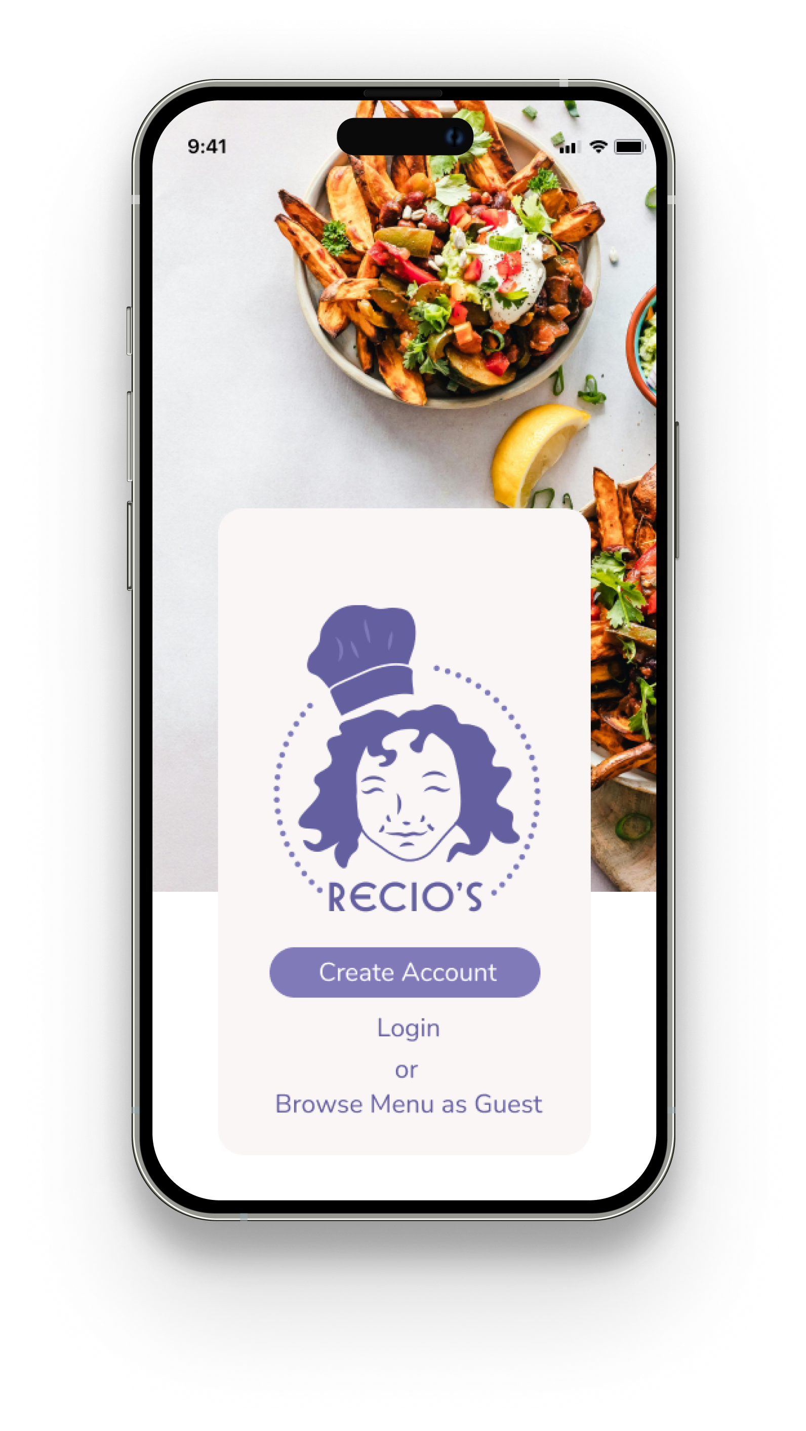
Added an option to browse menu as guest
Elminates the necessity of creating an account to view the menu
.png)
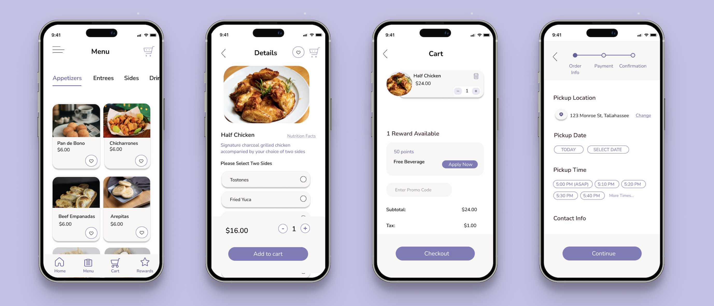
Add a view details button after ordering that navigates to orders page
Removes friction from user flow
.png)
Created redeemable rewards points page
Fufills user need for gamified rewards
.png)
Added sides/utensil customization to item description page
Allows flexibility of system for users
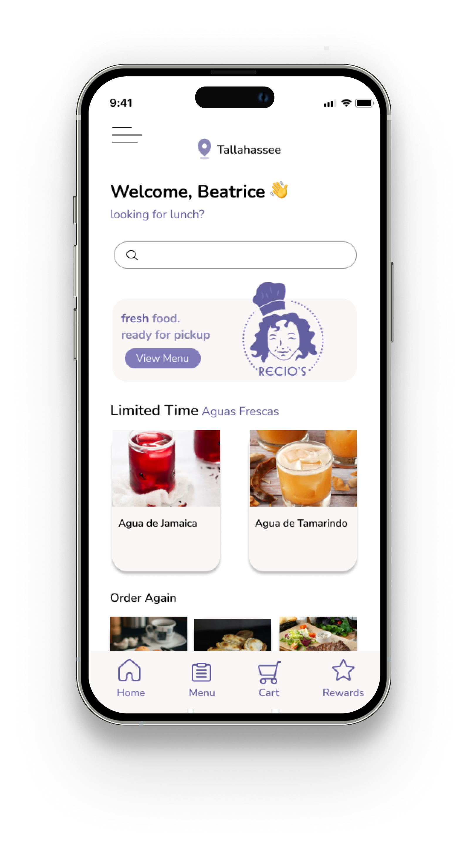
• Mockups
• High-Fidelity Prototypes
• Accessibility


Readable text and appropriate color contrast
Information hierarchy
Text labels used in addition to icons

• Takeways
• Next steps

